Making Markov Models Shiny: A Tutorial
Robert Smith and Paul Schneider, ScHARR, University of Sheffield
Introduction
This tutorial accompanies our open-access paper published here which contains a more detailed background to health economic modelling in R and Shiny. This paper can be cited as:
Smith R and Schneider P. Making health economic models Shiny: A tutorial. Wellcome Open Res 2020, 5:69. (https://doi.org/10.12688/wellcomeopenres.15807.1).
While the focus of this tutorial is on the application of shiny for health economic models, it will be useful to have a basic understanding of the underlying ‘sick-sicker-model’. In the following, we will provide a brief overview. For further details, readers are encouraged to consult Alarid-Escudero et al., 2019, Krijkamp et al., 2020 and the DARTH group website http://darthworkgroup.com/.
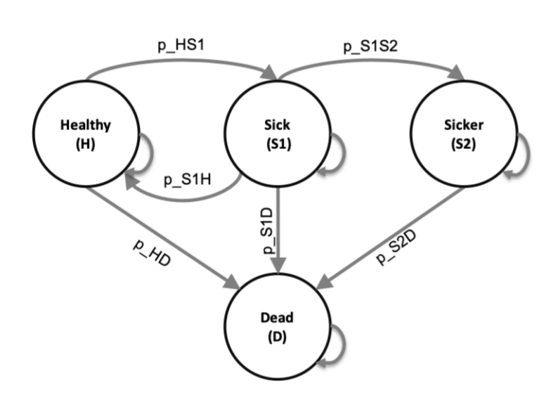
The Sick-Sicker model is a 4 state (Healthy, Sick, Sicker or Dead) Markov model. The cohort progresses through the model in cycles of equal duration, with the proportion of those in each health state in the next cycle being dependant on the proportion in each health state in the current cycle and the transition probability matrix. The diagram below shows the general model structure.
The analysis incorporates probabilistic sensitivity analysis (PSA) by creating a data-frame of PSA inputs (one row being one set of model inputs) based on cost, utility and probability distributions using the function f_gen_psa and then running the model with each set of PSA inputs using the model function f_MM_sicksicker. We therefore begin by describing the two functions f_gen_psa and f_MM_sicksicker in more detail before moving on to demonstrate how to create a user-interface. Note that we adapt the coding framework from Alarid-Escudero et al., (2019) to use the f_ prefix for functions.
Functions
Creating PSA inputs.
The f_gen_psa function returns a data-frame of probabilistic sensitivity analysis inputs: transition probabilities between health states using a beta distribution, hazard rates using a log-normal distribution, costs using a gamma distribution and utilities using a truncnormal distribution.
NOTE: in order to use the rtruncnorm function the user must first install and load the ‘truncnorm’ package using install.packages and library().
f_gen_psa <- function(n_sim = 1000, c_Trt = 50){

  require(truncnorm)

  df_psa <- data.frame(

    # Transition probabilities (per cycle)

    # prob Healthy -> Sick
    p_HS1   = rbeta(n = n_sim,
                    shape1 =  30,
                    shape2 =  170),

    # prob Sick    -> Healthy
    p_S1H   = rbeta(n = n_sim,
                    shape1 =  60,
                    shape2 =  60) ,

    # prob Sick    -> Sicker
    p_S1S2  = rbeta(n = n_sim,
                    shape1 =  84,
                    shape2 =  716),

    # prob Healthy -> Dead
    p_HD    = rbeta(n = n_sim,
                    shape1 =  10,
                    shape2 =  1990),

    # rate ratio death S1 vs healthy
    hr_S1   = rlnorm(n = n_sim,
                     meanlog =  log(3),
                     sdlog =   0.01),

    # rate ratio death S2 vs healthy
    hr_S2   = rlnorm(n = n_sim,
                     meanlog =  log(10),
                     sdlog =  0.02),

    # Cost vectors with length n_sim
    # cost p/cycle in state H
    c_H   = rgamma(n = n_sim,
                   shape = 100,
                   scale = 20),

    # cost p/cycle in state S1
    c_S1  = rgamma(n = n_sim,
                   shape = 177.8,
                   scale = 22.5),

    # cost p/cycle in state S2
    c_S2  = rgamma(n = n_sim,
                   shape = 225,
                   scale = 66.7),

    # cost p/cycle in state D
    c_D   = 0,

    # cost p/cycle of treatment
    c_Trt = c_Trt,

    # Utility vectors with length n_sim
    # utility when healthy
    u_H   = rtruncnorm(n = n_sim,
                       mean = 1,
                       sd = 0.01,
                       b = 1),

    # utility when sick
    u_S1  = rtruncnorm(n = n_sim,
                       mean = 0.75,
                       sd = 0.02,
                       b = 1),

    # utility when sicker
    u_S2  = rtruncnorm(n = n_sim,
                       mean = 0.50,
                       sd = 0.03,
                       b = 1),
    # utility when dead
    u_D   = 0,

    # utility when being treated
    u_Trt = rtruncnorm(n = n_sim,
                       mean = 0.95,
                       sd = 0.02,
                       b = 1)
  )

  return(df_psa)
}
Running the model for a specific set of PSA inputs
The function f_MM_sicksicker makes use of the with function which applies an expression (in this case the rest of the code) to a dataset (in this case params, which will be a row of PSA-inputs). It uses the params (one row of PSA inputs) to create a transition probability matrix m_P, and then moves the cohort through the simulation one cycle at a time, recording the proportions in each health state in a markov trace m_TR and applying the transition matrix to calculate the proportions in each health state in the next period. The function returns a vector of five results: Cost with no treatment, Cost with treatment, QALYs with no treatment and QALYs with treatment and an ICER. In this simple example treatment only influences utilities and costs, not transition probabilities
f_MM_sicksicker <- function(params) {
  # run following code with a set of data
  with(as.list(params), {

    # rate of death in healthy
    r_HD    = - log(1 - p_HD)
    # rate of death in sick
    r_S1D   = hr_S1 * r_HD
    # rate of death in sicker
    r_S2D   = hr_S2 * r_HD
    # probability of death in sick
    p_S1D   = 1 - exp(-r_S1D)
    # probability of death in sicker
    p_S2D   = 1 - exp(-r_S2D)
    # calculate discount weight for each cycle
    v_dwe <- v_dwc <- 1 / (1 + d_r) ^ (0:n_t)
    #transition probability matrix for NO treatment
    m_P <- matrix(0,
                  nrow = n_states,
                  ncol = n_states,
                  dimnames = list(v_n, v_n))
    # fill in the transition probability array

    ### From Healthy
    m_P["H", "H"]  <- 1 - (p_HS1 + p_HD)
    m_P["H", "S1"] <- p_HS1
    m_P["H", "D"]  <- p_HD
    ### From Sick
    m_P["S1", "H"]  <- p_S1H
    m_P["S1", "S1"] <- 1 - (p_S1H + p_S1S2 + p_S1D)
    m_P["S1", "S2"] <- p_S1S2
    m_P["S1", "D"]  <- p_S1D
    ### From Sicker
    m_P["S2", "S2"] <- 1 - p_S2D
    m_P["S2", "D"]  <- p_S2D
    ### From Dead
    m_P["D", "D"] <- 1
    # create empty Markov trace
    m_TR <- matrix(data = NA,
                   nrow = n_t + 1,
                   ncol = n_states,
                   dimnames = list(0:n_t, v_n))

    # initialize Markov trace
    m_TR[1, ] <- c(1, 0, 0, 0)

    ############ PROCESS #####################

    for (t in 1:n_t){ # throughout the number of cycles
      # estimate next cycle (t+1) of Markov trace
      m_TR[t + 1, ] <- m_TR[t, ] %*% m_P
    }

    ########### OUTPUT  ######################

    # create vectors of utility and costs for each state
    v_u_trt    <- c(u_H, u_Trt, u_S2, u_D)
    v_u_no_trt <- c(u_H, u_S1, u_S2, u_D)
    v_c_trt    <- c(c_H, c_S1 + c_Trt,
                    c_S2 + c_Trt, c_D)

    v_c_no_trt <- c(c_H, c_S1, c_S2, c_D)
    # estimate mean QALYs and costs
    v_E_no_trt <- m_TR %*% v_u_no_trt

    v_E_trt    <- m_TR %*% v_u_trt

    v_C_no_trt <- m_TR %*% v_c_no_trt

    v_C_trt    <- m_TR %*% v_c_trt

    ### discount costs and QALYs
    #   1x31 %*% 31x1 -> 1x1

    te_no_trt <- t(v_E_no_trt) %*% v_dwe
    te_trt    <- t(v_E_trt) %*% v_dwe

    tc_no_trt <- t(v_C_no_trt) %*% v_dwc

    tc_trt    <- t(v_C_trt)    %*% v_dwc

    results <- c(
      "Cost_NoTrt" = tc_no_trt,
      "Cost_Trt"   = tc_trt,
      "QALY_NoTrt" = te_no_trt,
      "QALY_Trt" = te_trt,
      "ICER" = (tc_trt - tc_no_trt)/
        (te_trt - te_no_trt)
    )

    return(results)
  }) # end with function
} # end f_MM_sicksicker function
Creating a Wrapper
When using a web application it is likely that the user will want to be able to change parameter inputs and re-run the model. In order to make this simple, we recommend wrapping the entire model into a function. We call this function f_wrapper, using the prefix f_ to denote that this is a function.
The wrapper function has as its inputs all the things which we may wish to vary using R-Shiny. We set the default values to those of the base model in any report/publication. The model then generates PSA inputs using the f_gen_psa function, creates a table of results, and finally loops through the PSA, running the model with each set of PSA inputs (a row from df_psa) in turn. The function then returns the results in the form of a dataframe with n=5 columns and n=psa rows. The columns contain the costs and qalys for treatment and no treatment for each PSA run, as well as an ICER for that PSA run.
f_wrapper <- function(

  #-- User adjustable inputs --#

  # age at baseline
  n_age_init = 25,
  # maximum age of follow up
  n_age_max  = 110,
  # discount rate for costs and QALYS
  d_r = 0.035,
  # number of simulations
  n_sim   = 1000,
  # cost of treatment
  c_Trt   = 50

){

  # need to specify environment of inner functions (to use outer function enviroment)
  # alternatively - define functions within the wrapper function.
  environment(f_gen_psa)         <- environment()
  environment(f_MM_sicksicker)   <- environment()

  #-- Unadjustable inputs --#

  #  number of cycles
  n_t <- n_age_max - n_age_init
  # the 4 health states of the model:
  v_n <- c("H", "S1", "S2", "D")
  # number of health states
  n_states <- length(v_n)

  #-- Create PSA Inputs --#

  df_psa <- f_gen_psa(n_sim = n_sim,
                      c_Trt =  c_Trt)

  #--  Run PSA  --#

  # Initialize matrix of results outcomes
  m_out <- matrix(NaN,
                  nrow = n_sim,
                  ncol = 5,
                  dimnames = list(1:n_sim,
                                  c("Cost_NoTrt", "Cost_Trt",
                                    "QALY_NoTrt", "QALY_Trt",
                                    "ICER")))

  # run model for each row of PSA inputs
  for(i in 1:n_sim){

    # store results in row of results matrix
    m_out[i,] <- f_MM_sicksicker(df_psa[i, ])

  } # close model loop


  #-- Return results --#

  # convert matrix to dataframe (for plots)
  df_out <- as.data.frame(m_out)

  # output the dataframe from the function
  return(df_out)

} # end of function
The wrapper returns a data frame with the costs and the QALY results for Treatement and No Treatment, and the corresponding ICER. Each row corresponds to one PSA-draw. To check what the result looks like, we can run the model, manually specifying the treatment costs (c_Trt=100), initial age (n_age_init = 25), and number of draws (n_sim = 1000).
df_model_res = f_wrapper(
    c_Trt = 200,
    n_age_init = 25,
    n_sim = 1000)

head(df_model_res)
| Cost_NoTrt | Cost_Trt | QALY_NoTrt | QALY_Trt | ICER |
|---|---|---|---|---|
| 97372.57 | 98915.22 | 16.25702 | 16.96409 | 2181.735 |
| 115454.87 | 117169.32 | 17.92764 | 18.44866 | 3290.594 |
| 106463.55 | 108014.03 | 17.29429 | 17.97650 | 2272.730 |
| 78588.10 | 79769.39 | 17.20124 | 17.94575 | 1586.671 |
| 97470.96 | 98672.44 | 20.13777 | 20.77199 | 1894.426 |
| 102619.44 | 104177.11 | 18.52157 | 19.13199 | 2551.819 |
Integrating into R-Shiny
The method so far has involved wrapping the model into a function, which takes some inputs and returns a single data-frame output. The next step is to integrate the model function into a shiny web-app. This is done within a single R file, which we call app.R. This can be found here: https://github.com/RobertASmith/healthecon_shiny/tree/master/App.
The app.R script has three main parts, each are addressed in turn below:
- set-up (getting everything ready so the ui and server can be created)
- user interface (what people will see)
- server (stuff going on in the background)
Figure 2 depicts the relationship between the server and the user interface within the Shiny application. On a conceptual level, the user interface has three components: Shiny inputs (objects that the user can specify, e.g. by inputting a number), Shiny outputs (objects created on the server side, e.g. plots and tables), and non-interactive features (any fixed elements, such as texts, headings, logos etc.). The server works almost like a normal R session. It runs various R operations, including the model function, which takes non-Shiny inputs (defined only on the server side) and some Shiny inputs from the user interface. The results are then send to the user interface and displayed as Shiny outputs.
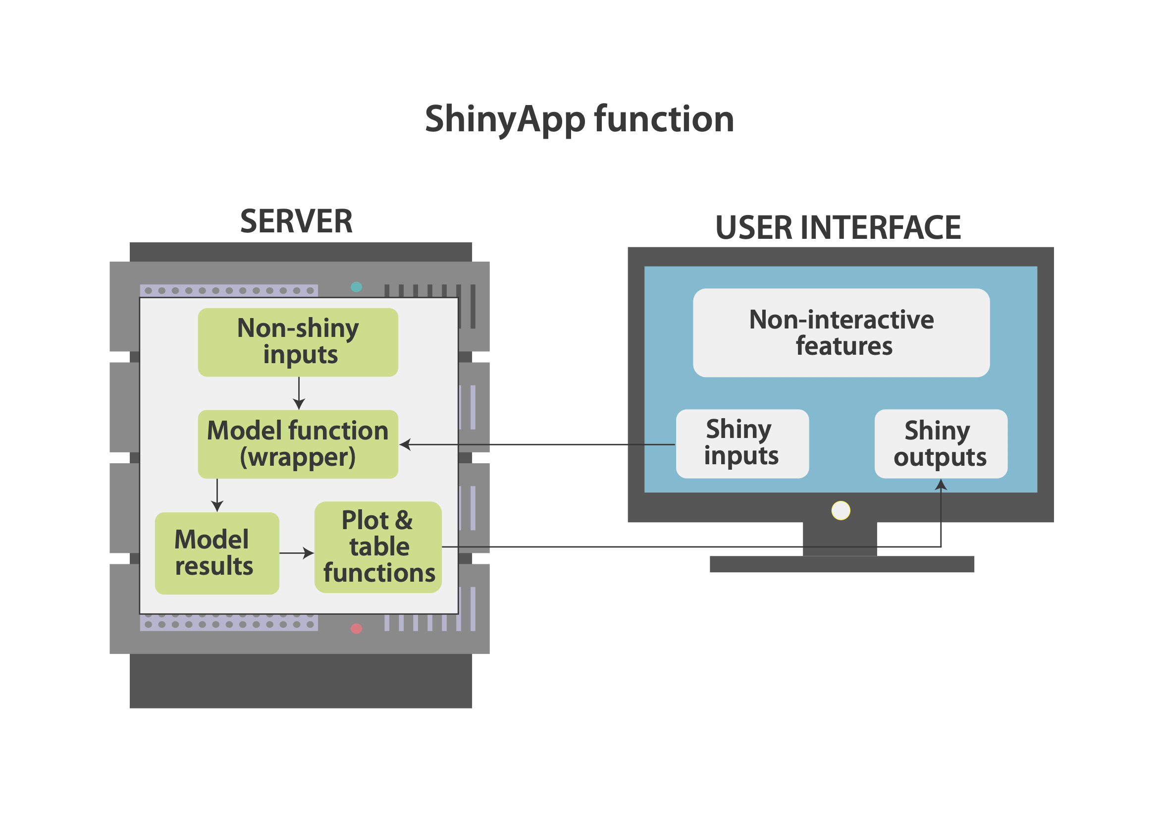 Figure 2: Application Structure.
Set-up
The set-up is relatively simple, load the R-Shiny package from your library so that you can use the R-Shiny function. The next step is to use the source function in baseR to run the script which creates the f_wrapper function, being careful to ensure your relative path is correct (’./wrapper.R’ should work if the app.R file is within the same folder). The function shinyApp at the end of the app file is reliant on the shiny package so please ensure that the shiny package is installed, using install.packages(“shiny”) if it is not.
# Install 'shiny' & 'truncnorm' if you haven't already.
  # install.packages("shiny")
  # install.packages("truncnorm")

# load packages from library
library(truncnorm)
library(shiny)
User Interface
The user interface is extremely flexible, we show the code for a very simple structure (fluidpage) with a sidebar containing inputs and a main panel containing outputs. We have done very little formatting in order to minimize the quantity of code while maintaining basic functionality. In order to get an aesthetically pleasing application we would have much more sophisticated formatting, relying on CSS, HTML and Javascript.
This example user interface below is made up of two components, a titlepanel and a sidebar layout display.The sidebarLayout display has within it a sidebar and a main panel. These are all contained within the fluidpage function which creates the ui.
The title panel contains the title “Sick Sicker Model in Shiny”, the sidebar panel contains two numeric inputs and a slider input (“Treatment Cost”,“PSA runs”,“Initial Age”) and an Action Button (“Run / update model”).
The values of the inputs have ids which are used by the server function, we denote these with the prefix “SI” to indicate they are ‘Shiny Input’ objects (SI_c_Trt,SI_n_sim,SI_n_age_init), and distiguish them from the non-Shiny inputs in the server (e.g. c_Trt). Note that this is an addition of the coding framework provided by Alarid-Escudero et al., (2019).
The action button also has an id, this is not an input into the model wrapper (f_wrapper) so we leave out the SI and call it “run_model”.
The main panel contains two objects which have been output from the server: tableOutput(“SO_icer_table”) is a table of results, and plotOutput(“SO_CE_plane”) is a cost-effectiveness plane plot. It is important that the format (e.g. tableOutput) matches the format of the object from the server (e.g. SO_icer_table). Again, the SO prefix reflects the fact that these are Shiny Outputs. The two h3() functions are simply headings which appear as “Results Table” and “Cost-effectiveness Plane”.
ui <- fluidPage(    # creates empty page

  # title of app
  titlePanel("Sick Sicker Model in Shiny"),

  # layout is a sidebar-layout
  sidebarLayout(

    sidebarPanel( # open sidebar panel

      # input type numeric
      numericInput(inputId = "SI_c_Trt",
                   label = "Treatment Cost",
                   value = 200,
                   min = 0,
                   max = 400),

      numericInput(inputId = "SI_n_sim",
                   label = "PSA runs",
                   value = 1000,
                   min = 0,
                   max = 400),

      # input type slider
      sliderInput(inputId = "SI_n_age_init",
                  label = "Initial Age",
                  value = 25,
                  min = 10,
                  max = 80),

      # action button runs model when pressed
      actionButton(inputId = "run_model",
                   label   = "Run model")

    ),  # close sidebarPanel

    # open main panel
    mainPanel(

      # heading (results table)
      h3("Results Table"),

      # tableOutput id = icer_table, from server
      tableOutput(outputId = "SO_icer_table"),

      # heading (Cost effectiveness plane)
      h3("Cost-effectiveness Plane"),

      # plotOutput id = SO_CE_plane, from server
      plotOutput(outputId = "SO_CE_plane")

    ) # close mainpanel

  ) # close sidebarlayout

) # close UI fluidpage
Server
The server is marginally more complicated than the user interface. It is created by a function with inputs and outputs. The observe event indicates that when the action button (run_model) is pressed the code within the curly brackets is run. The code wil be re-run if the button is pressed again.
The first thing that happens when the run_model button is pressed is that the model wrapper function f_wrapper is called, with the user interface inputs (SI_c_Trt,SI_n_age_init,SI_n_sim) as inputs to the function. The input$ prefix indicates that the objects have come from the user interface. The results of the model are stored as the dataframe object df_model_res.
The ICER table is then created and output (note the prefix output$) in the object SO_icer_table. See previous section on the user interface and note that the tableOutput fucntion was reliant on SO_icer_table. The function renderTable rerenders the table continuously so that the table always reflects the values from the data-frame of results created above. In this simple example we have created a table of results using code within the script. In reality we would generally use a custom function which creates a publication quality table which is aesthetically pleasing. There are numerous packages which provide this functionality (e.g. BCEA, Darthpack, Heemod)
The cost-effectiveness plane is created in a similar process, using the renderPlot function to continuously update a plot which is created using baseR plot function using ICERs calculated from the results dataframe df_model_res. For aesthetic purposes we recommend this is replaced by a ggplot plot which has much improved functionality.
# Shiny server function ----
server <- function(input, output){

  # when action button pressed ...
  observeEvent(input$run_model,
               ignoreNULL = F, {

                 # Run model function with Shiny inputs
                 df_model_res = f_wrapper(
                   c_Trt = input$SI_c_Trt,
                   n_age_init = input$SI_n_age_init,
                   n_sim = input$SI_n_sim)

                 #-- CREATE COST EFFECTIVENESS TABLE --#

                 # renderTable continuously updates table
                 output$SO_icer_table <- renderTable({

                   df_res_table <- data.frame( # create dataframe

                     Option =  c("Treatment","No Treatment"),

                     QALYs  =  c(mean(df_model_res$QALY_Trt),
                                 mean(df_model_res$QALY_NoTrt)),

                     Costs  =  c(mean(df_model_res$Cost_Trt),
                                 mean(df_model_res$Cost_NoTrt)),

                     Inc.QALYs = c(mean(df_model_res$QALY_Trt) -
                                     mean(df_model_res$QALY_NoTrt),
                                   NA),

                     Inc.Costs = c(mean(df_model_res$Cost_Trt) -
                                     mean(df_model_res$Cost_NoTrt),
                                   NA),

                     ICER = c(mean(df_model_res$ICER), NA)

                   ) # close data-frame

                   # round the data-frame to two digits
                   df_res_table[,2:6] = round(
                     df_res_table[,2:6],digits = 2)

                   # print the results table
                   df_res_table

                 }) # table plot end.


                 #--  CREATE COST EFFECTIVENESS PLANE --#

                 # render plot repeatedly updates.
                 output$SO_CE_plane <- renderPlot({

                   # calculate incremental costs and qalys
                   df_model_res$inc_C <- df_model_res$Cost_Trt -
                     df_model_res$Cost_NoTrt

                   df_model_res$inc_Q <- df_model_res$QALY_Trt -
                     df_model_res$QALY_NoTrt

                   # create cost effectiveness plane plot

                   plot(
                     # x y are incremental QALYs Costs
                     x = df_model_res$inc_Q,
                     y = df_model_res$inc_C,

                     # label axes
                     xlab = "Incremental QALYs",
                     ylab = "Incremental Costs",

                     # set x-limits and y-limits for plot.
                     xlim = c( min(df_model_res$inc_Q,
                                   df_model_res$inc_Q*-1),
                               max(df_model_res$inc_Q,
                                   df_model_res$inc_Q*-1)),

                     ylim = c( min(df_model_res$inc_C,
                                   df_model_res$inc_C*-1),
                               max(df_model_res$inc_C,
                                   df_model_res$inc_C*-1)),

                     # include y and y axis lines.
                     abline(h = 0,v=0)

                   ) # CE plot end

                 }) # renderplot end

               }) # Observe event end


} # Server end
Running the app
The app can be run within the R file using the function shinyApp which depends on the ui and server which have been created and described above. Running this creates a shiny application in the local environment (e.g. your desktop). In order to deploy the application onto the web the app needs to be published using the publish button in the top right corner of the R-file in RStudio (next to run-app).
# Running the App ----

shinyApp(ui, server)
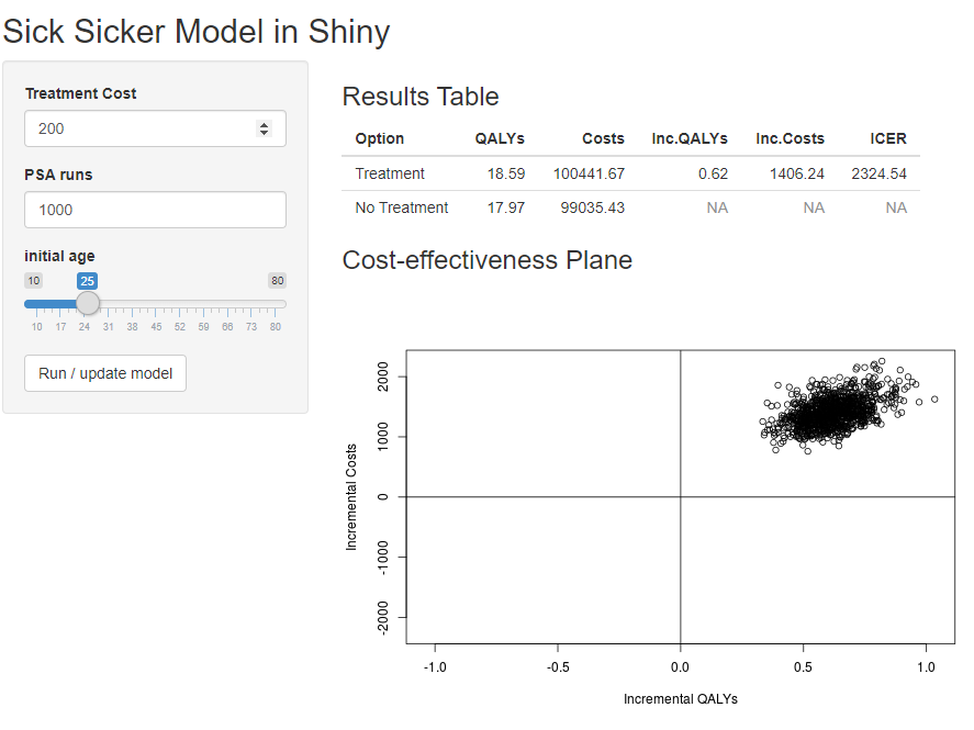
The end product should look like this ShinyApp
Additional Functionality
The example Sick-Sicker web-app that has been created is a simple, but functional, R-Shiny user interface for a health economic model. There are a number of additional functionalities, many of which are covered in an online book by Hadley Wickham (Wickham, 2020):
fully customised user interface aesthetics. Since the user interface is translated into HTML and CSS it is possible to customise all components (such as colors, fonts, graphics, layouts and backgrounds.
leverage many popular R packages to visualise model inputs (e.g. distributions) and outputs (e.g. plots and results tables).
upload files containing input parameters and data to the app.
download specific figures and tables from the app.
create a downloadable full report including model inputs and outputs.
send model results/report to an email address once the model has finished running.
We are in the process of creating an extended tutorial which covers many of these functionalities.
Conclusion
The aim of this tutorial was to provide a useful reference for those hoping to create a user interface for a health economic model created in R. It is our hope that more health economic models will be created open source, and open access so that other economists can critique, learn from and adapt these models. The creation of user interfaces for these apps should improve transparency further, allowing stakeholders and third parties to conduct their own sensitivity analysis. We are particularly interested in the use of R and R-Shiny in public health decision modelling, so feel free to get in touch with any queries.
References
Alarid-Escudero, F., Krijkamp, Eline M, Enns, E.A., Hunink, M., Pechlivanoglou, P. and Jalal, H. (2020). Cohort state-transition models in R: From conceptualization to implementation. arXiv preprint arXiv:2001.07824.
Alarid-Escudero, F., Krijkamp, Eline M, Pechlivanoglou, P., Jalal, H., Kao, Szu-Yu Zoe, Yang, A. and Enns, E.A. (2019). A need for change! A coding framework for improving transparency in decision modeling. PharmacoEconomics, 37, pp.1329-1339.
Baio, G, Berardi, A, Heath and A (2017). Bayesian cost-effectiveness analysis with the r package BCEA. [online] Springer. Available at: http://www.springer.com/us/book/9783319557168.
Baio, G., Berardi, A. and Heath, A. (2017). BCEAweb: A user-friendly web-app to use BCEA. Springer, pp.153-166.
Baio, G. and Heath, A. (2017). When simple becomes complicated: why Excel should lose its place at the top table. SAGE Publications Sage UK: London, England.
Beeley, C. (2016). Web application development with R using Shiny. Packt Publishing Ltd.
DARTH Workgroup (2020). Decision analysis in r for technologies in health. [online] Available at: http://darthworkgroup.com/ [Accessed Mar. 2020].
Dowle, M. and Arun Srinivasan (2019). data.table: Extension of data.frame. [online] Available at: https://CRAN.R-project.org/package=data.table.
Filipovic-Pierucci, A., Zarca, K. and Durand-Zaleski, I. (2016). Markov models for health economic evaluation modelling in r with the heemod package. Value in Health, 19, p.A369.
Gendron, J. (2016). Introduction to r for business intelligence. Packt Publishing Ltd.
Hatswell, A.J. and Chandler, F. (2017). Sharing is caring: the case for company-level collaboration in pharmacoeconomic modelling. PharmacoEconomics, 35, pp.755-757.
Hester, J. (2019). gmailr: Access the “gmail” “RESTful” API. [online] Available at: https://CRAN.R-project.org/package=gmailr.
Incerti, D., Thom, H., Baio, G. and Jansen, Jeroen P (2019). R you still using excel? The advantages of modern software tools for health technology assessment. Value in Health, 22, pp.575-579.
Jalal, H., Pechlivanoglou, P., Krijkamp, E., Alarid-Escudero, F., Enns, E. and Hunink, MG Myriam (2017). An overview of R in health decision sciences. Medical decision making, 37, pp.735-746.
Jansen, Jeroen P, Incerti, D. and Linthicum, M.T. (2019). Developing open-source models for the US Health System: practical experiences and challenges to date with the Open-Source Value Project. PharmacoEconomics, 37, pp.1313-1320.
Krijkamp, Eline M, Alarid-Escudero, F., Enns, E.A., Jalal, Hawre J, Hunink, MG Myriam and Pechlivanoglou, P. (2018). Microsimulation modeling for health decision sciences using R: a tutorial. Medical Decision Making, 38, pp.400-422.
National Institute for Health and Care Excellence (Great Britain (2014). Guide to the processes of technology appraisal. National Institute for Health and Care Excellence.
Owen, R.K., Bradbury, N., Xin, Y., Cooper, N. and Sutton, A. (2019). MetaInsight: An interactive web-based tool for analyzing, interrogating, and visualizing network meta-analyses using R-shiny and netmeta. Research synthesis methods. Wiley Online Library.
Shiny (2020). Build your entire UI with HTML. [online] Available at: https://shiny.rstudio.com/articles/html-ui.html [Accessed Mar. 2020].
Sievert, C. (2018). plotly for R. [online] Available at: https://plotly-r.com.
Smith, R. (2020). RobertASmith/paper_makeHEshiny: Making health economics shiny: a tutorial. [online] Available at: https://doi.org/10.5281/zenodo.3730897.
Smith R and Schneider P. Making health economic models Shiny: A tutorial [version 1; peer review: awaiting peer review]. Wellcome Open Res 2020, 5:69 (https://doi.org/10.12688/wellcomeopenres.15807.1)
Strong, M., Oakley, J.E. and Brennan, A. (2014). Estimating multiparameter partial expected value of perfect information from a probabilistic sensitivity analysis sample: a nonparametric regression approach. Medical Decision Making, 34, pp.311-326.
Wickham, H. (2020). Mastering shiny. [online] Available at: https://mastering-shiny.org/index.html [Accessed Mar. 2020].
Wickham, H. (2016). ggplot2: Elegant graphics for data analysis. [online] Springer-Verlag New York. Available at: https://ggplot2.tidyverse.org.